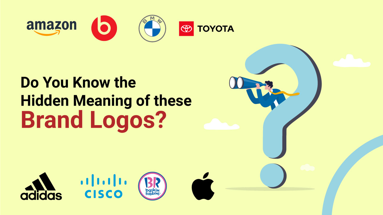
Do you know how many logos you encounter in your day-to-day lives? Your clothes, gadgets, shoes, billboards, and a myriad of other things that we see every day have the logos of brands imprinted on them. Throughout the days, brand logos hit us with so many visual stimuli, that we often forgo paying attention to details. However, logos are so much more than compact brand ambassadors. They are a brand’s personification in the real world. Many brands design logos with hidden meanings to subtly influence customer perceptions. Which brands? Well, here’s an interesting brief on brand logos and their meanings. Let’s examine some well-known brand logos and find out what they actually mean.
Amazon
Sells everything from A to Z
The Amazon logo has an arrow that looks like a smiling face. It associates the brand with joy and gives it a positive connotation. However, it also delivers a subliminal message. The smile-shaped arrow points from the letter A to the letter Z. This signifies that Amazon sells everything from A to Z.
Beats
Human head with headphones
The simple Beats logo has a “b” enclosed in a circle followed by the brand name. But, do you know that the circle isn’t a circle. Instead, it denotes a human’s head, and the “b” letter symbolizes the brand’s headphones, which renders the brand an emotional element and allows the customer to visualize themselves in the headphones.
BMW
Aviation History?
Motor giant BMW has an illustriously interesting history behind its logo. The company has a well-known history in aviation and the company’s logo represents it. Most people think that the epic blue and white checkered logo represents a propeller in motion, which is wrong. Instead, the blue and white colors are the official representation of the Bavarian Free state. Back then, BMW wanted to use the hues of the Bavarian Free State in their logo. However, doing so was illegal. Thus they reversed the shades and accidentally, crafted the propeller design.
Toyota
“T” with hearts
Toyota is a household name in the car manufacturing industry. The logo is stylized with a “T” within a ring. The ring also has three eclipses that represent three hearts. The first eclipse represents the heart of the product, the second represents the heart of the customer, and the third represents the heart of technological advancement. We bet you didn’t see that coming!
Adidas
Conquering mountains
Known for its simple yet catchy, three-stripe logo, Adidas created three stripes that would look good on a shoe. However, in the 90s, the logo was tweaked and the tree stripes were rotated diagonally on their side to give the illusion of a mountain peak. The new design represents the struggles that brilliant athletes endure to achieve greatness.
Cisco
The Golden Gate Bridge
The worldwide internet networking leader, Cisco is located in San Francisco. Although the namesake doesn’t have a concealed meaning, the blue stripes outside the logotype don’t just symbolize an electromagnet; they also illustrate a Golden Gate Bridge.
Baskin Robbins
Number of ice creams
Known for its ostensibly infinite flavors of ice creams (31, to be precise), Baskin Robbins is an exceptionally beloved brand. The famous number “31” is disguised in the ‘B’ and ‘R’ of the logo and the logo represents energy and fun.
Apple
Just an Apple
The name Apple has a single explanation- Steve Jobs loved the sound of it. There are many urban myths surrounding the Apple logo that the bite mark represents the apple of knowledge from the tree in the garden of Eden. However, the bite mark was only there to render the logo scale- so, somebody won’t mistake it for a cherry or some other fruit.
Most people don’t know that getting to the upper echelon of design involves a lot of creativity, hard work, and a pinch of luck. Every successful brand logo has a fascinating story behind it. The deeper you dig, the more you manifest the talent of logo designers.
Want a stunningly enticing logo for your brand that embeds your origin story? Reach out to the logo designing experts at Yuved Technology now!

