Chronicles of Starbucks Logo: 1971-2011
Starbucks is a tremendously prosperous business that battled its way to the top of the coffee shop sector. With more than 30,000 outlets worldwide, they are the industry’s dominant Coffee Marketing giant. They are active in about 80 nations and since then they have not stopped. Starbucks’ branding has a part to play in how successful it has become. Let’s study the history of the Starbucks logo, from its modest origins in 1971 to being the modern-day worldwide coffee juggernaut.
Unfolding the Starbucks Logos
The Starbucks brand has a distinctive appearance and feel that sticks out and attracts attention. Starbucks has nailed both brand awareness and loyalty by having a unique and recognized logo—a double win for the company. Comparing the present logo to earlier versions, Starbucks is more understated. It enables them to promote their message of inspiration and nurture throughout the world by printing their logo on items like coffee mugs and t-shirts as well as on websites and other promotional materials.
Let’s see how the logo was created.
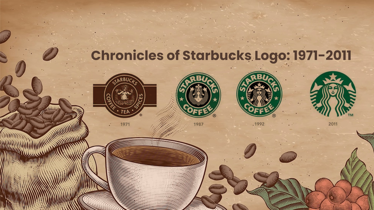
1971
The name Starbucks didn’t always exist. The initial owners originally gave their business the name Pequod in honor of the whaling ship from the Moby-Dick myth. They quickly recognized that this name wasn’t appealing, so they changed it to Starbuck, the ship’s chief mate.
Their first logo, a twin-tailed mermaid, was inspired by this nautical concept. These so-called sirens would entice mariners to wreck their ships off the shore of little islands, according to Greek mythology. The Starbucks logo would accomplish the same thing, but it would persuade them to purchase delicious coffee. The mermaid was clearly visible in the first logo, holding her tail in both of her hands, and the color was coffee brown (earthy, sturdy, and caring).
1987
To reflect the company’s new mission, the color of the logo changed from brown to Kelly green. Additionally, the phrases “tea” and “spices” were omitted. Instead, they designed a new wordmark with two stars that connect the words: Starbucks Coffee.
The use and positioning of the stars made the logo stand out and pushed its brand identity to be recognizable and memorable. Howard Schultz bought the company during this time and promptly changed the logo. This marked the beginning of the Starbucks logo’s development.
Terry Heckler, an artist, and designer, was hired by Schultz to assist with the new logo. Heckler made some significant adjustments to the design, taking cues from the port of Seattle and hoping to embrace the notion of a new beginning and the potential to develop and flourish. The mermaid was transformed. She retained her crown, became sleeker, and her hair covered her breasts.
1992
Starbucks underwent its third logo redesign in 1992. A closer, more personal perspective of the mermaid was created by the logo zooming in. Only a small of her tail was visible, and her naval had vanished entirely.
Additionally, the font was sharpened and gave a more polished and contemporary appearance. The outcome is a logo with a more polished appearance and feels, with the siren taking center stage.
2008
In honor of its 40th anniversary, the business made the decision to make a significant rebranding push.
In a nod to the past, they updated the original 1971 logo with a few contemporary additions and altered the green of the emblem to black.
As a result, they suffered a failure and severe customer backlash. Their audience wouldn’t accept anything other than the cherished green logo because their green branding and straightforward logo design had grown so well-known and well-liked among the general public.
Just goes to illustrate how strong the connection between your logo and branding is.
2011
When Starbucks realized how strong and popular their brand had become, they removed many of the recognizable design components from it, giving it a very contemporary appearance and feel with minimalism at the forefront.
The outer ring, stars, and wordmark were bid farewell by the group. The siren was expanded and given a makeover, becoming the only emphasis of the logo. Her new, more symmetrical eyes, nose, and hair also brought back the image’s signature green background color.
According to Starbucks, this most recent strategy enables the logo to be recognizable and relatable to audiences everywhere.
Storytime is Over
The development of the Starbucks logo has taught us a lot. They were able to establish a strong brand presence not only in America but also in other nations by having a distinctive and identifiable mascot. Their logo had the strongest potential association with their brand from the beginning. Without the emblem, there was no Starbucks coffee. The Starbucks logo is the ideal illustration of how a company’s identification and branding initiatives go hand in hand with an excellent logo.
By updating its logo, Starbucks has kept its branding current and communicated to customers that it is adapting to the times. Do you want to create your own company logo? Get in touch with our experts today.
And more such exciting news about brands and their stories follow our newsroom today!!

